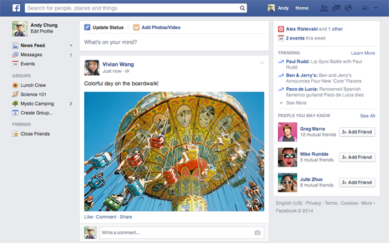
When you log on to your Facebook account, look at the news feed again. Do you see a difference?
Facebook started tinkering with the newsfeed almost a year ago. It spent months on the design and came out with a navigation bar, bigger photos and other changes. The new design was rolled out to only a few account holders. Apparently, it did not find many takers and Facebook was forced to withdraw the changes and go back to the drawing board.
Now, the company is on the verge of rolling out another new newsfeed and this time it has made use of the lessons it learned from its earlier failed rollout. Facebook has discarded most of the icons that cluttered the old navigation bar and has brought in new icons, fonts (Arial and Helvetica), bigger photos and more. In fact, it has done away with so many buttons, the new design looks almost minimalistic.
What do you think about the Facebook newsfeed getting a re-design?
MORE SOCIAL MEDIA STORIES:
- Oscars 2014: This is the Most Retweeted Image of All Time
- LinkedIn Launches a Chinese Language Site: Will Censorship Apply?
- Elon Musk Thanks Social Media for Helping to Save Tesla’s Electric Car Reputation
Source: The Verge
"ExpatGo welcomes and encourages comments, input, and divergent opinions. However, we kindly request that you use suitable language in your comments, and refrain from any sort of personal attack, hate speech, or disparaging rhetoric. Comments not in line with this are subject to removal from the site. "


